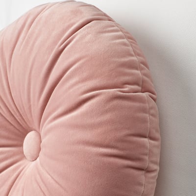
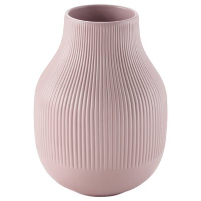
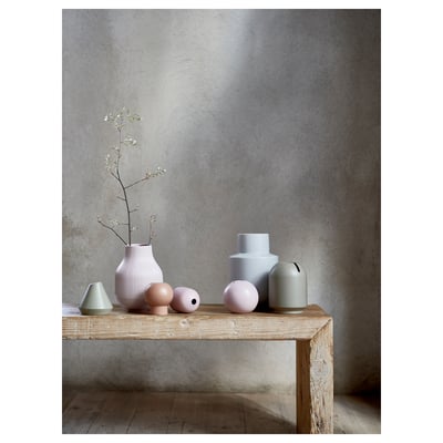
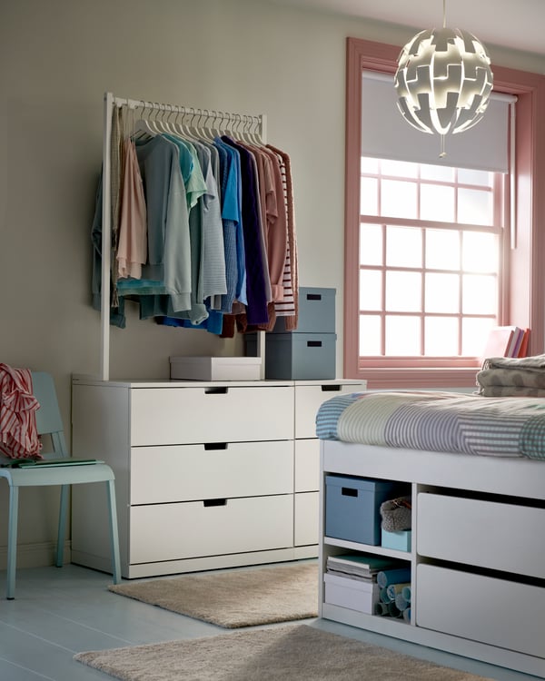
Trend: Pretty Pastels
We will see lots of pastel colours in the interior this year. Pastel colours are often labelled as girly or sweet, but this is not the case. If you know how to combine the colours well, you can use soft pastel accents to create a very beautiful, subtle and fresh interior that suits everyone.
- Product information page
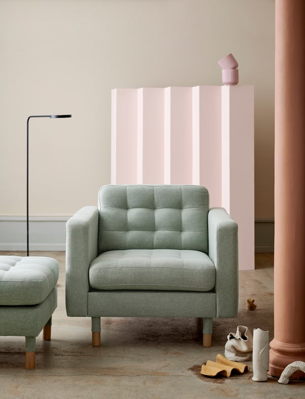
Use your imagination
The pastel trend requires a little imagination and creativity. Don't hold back in the styling; mixing colours and materials is like an adult's playground. The circle, tightly graphic or organically formed, is a basic shape in this trend. From furniture to the smallest styling details in accessories. Combined with straight stately lines. For the right sparkle, glass and porcelain objects appeal to the imagination.