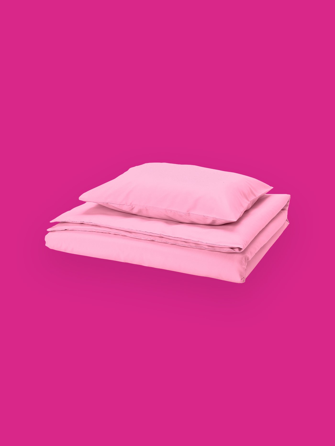
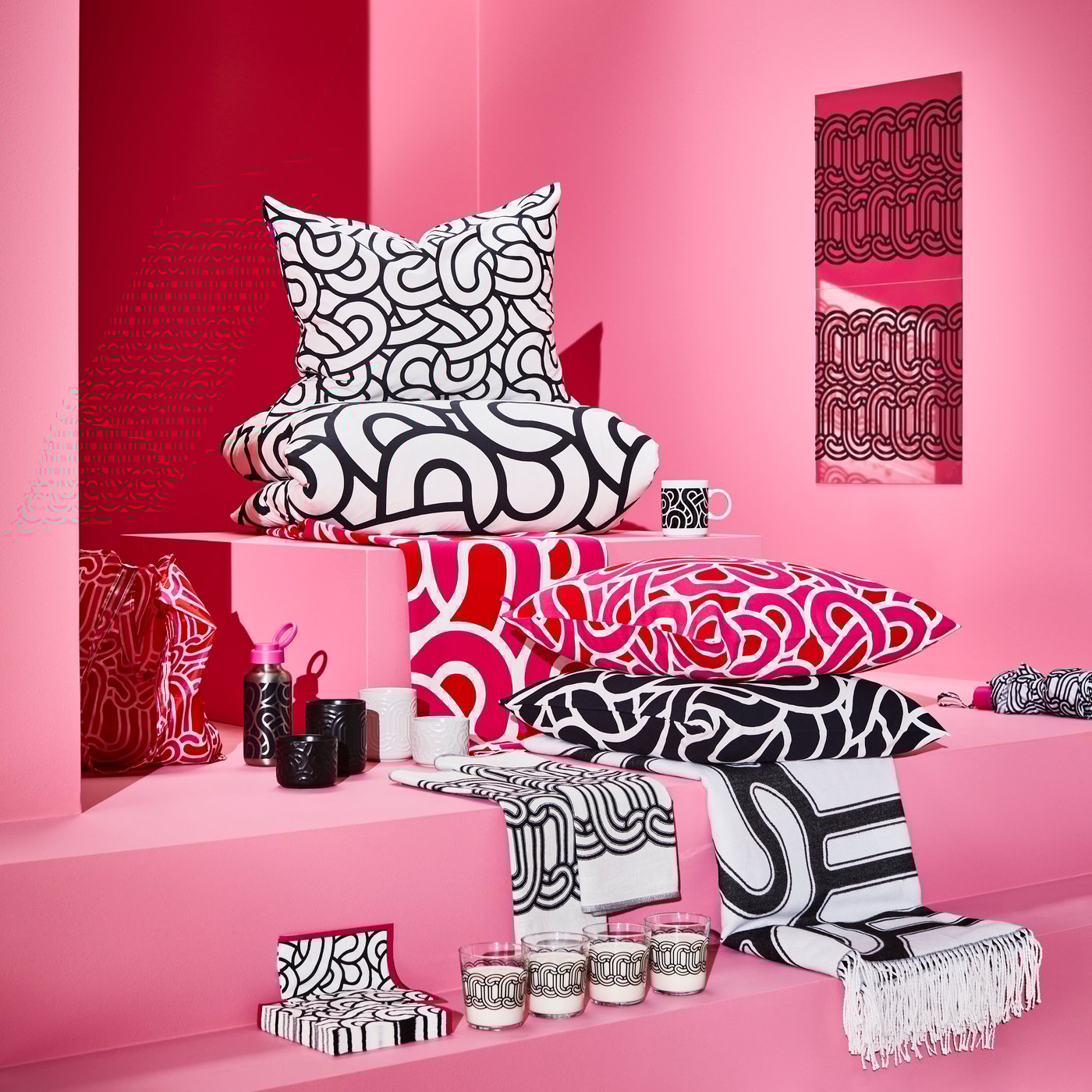
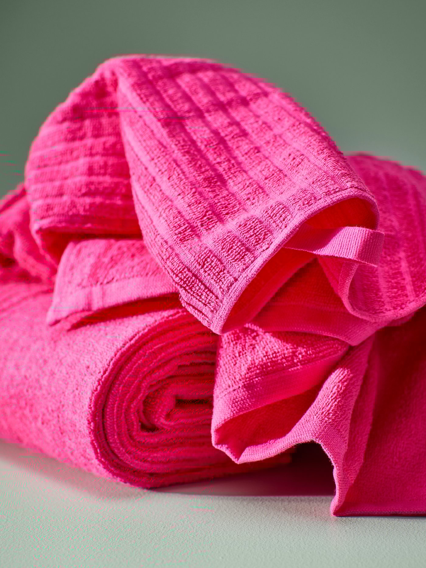
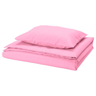
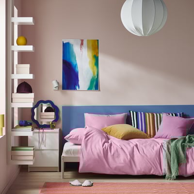
Rhapsody in pink
I love a style that has contrast. It can be classical pieces mixed with industrial or it can be a pop of bright pink in a sea of white. My boyfriend and I got our first place a couple of months ago here in Milan. We were on a budget, but we knew we wanted to make a music studio in the apartment. I make most of my music at home.
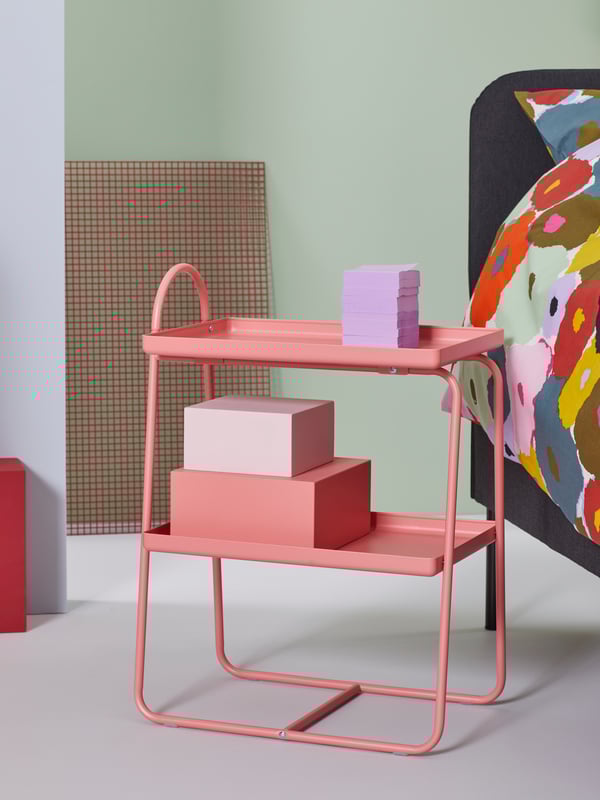
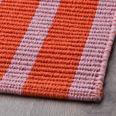
There are a lot of classical furniture pieces—like velvet chairs (armchair dark red). Full of rugs. The one thing I knew was that I didn’t want it to be boring. For playing music, curtains and rugs are a must. I have rugs everywhere.

Shop the video
Shop the video
Curated by me | Chiamamifaro
“
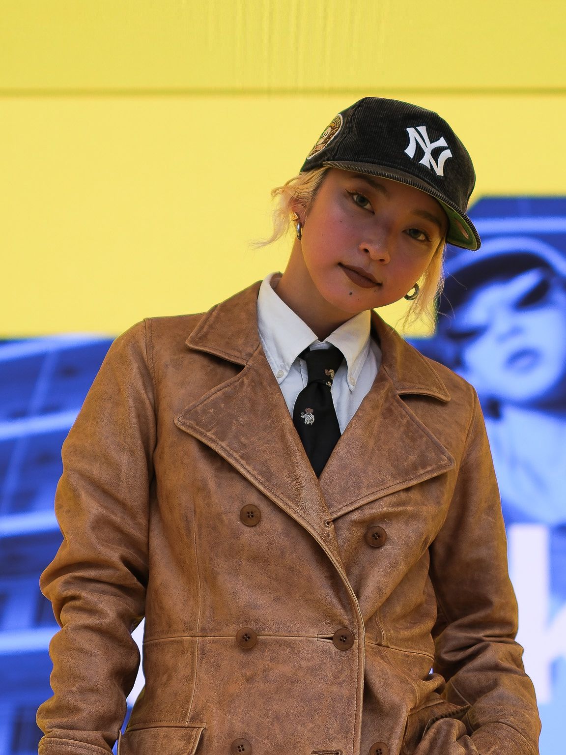
I like contrasts. I like to be comfortable on stage and it reflects in my style. My two colours are black and pink. My personal style is a mix of boxy, menswear, ties and schoolgirl uniforms. But I add in a feminine contrasts with pink tips in my hair. And yes, I often match my clothes so they compliment the pink in my hair.”
ChiamamifaroSinger, Co-creator