The softened space

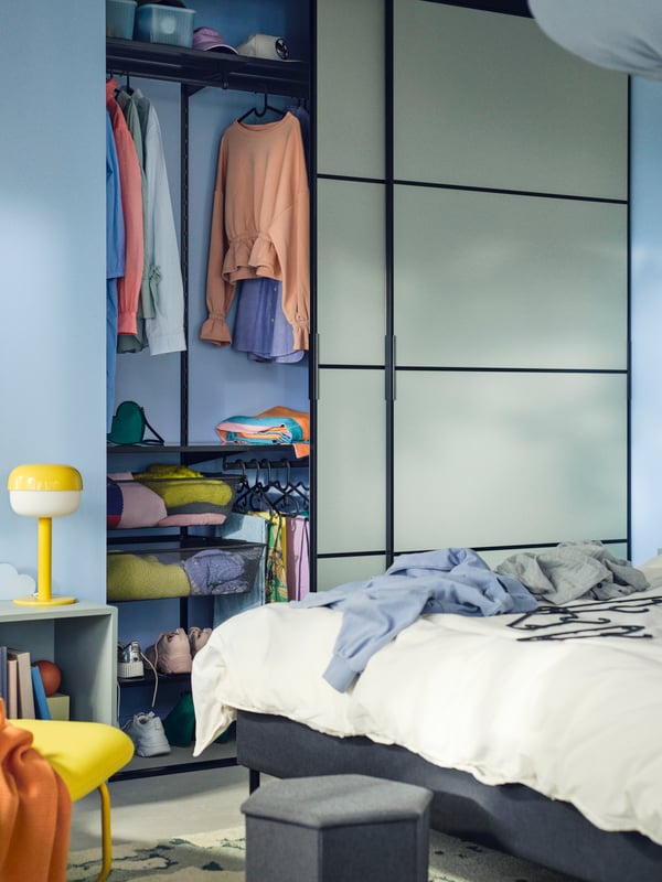
Spaces are shifting towards softness and tranquility, with pastel tones leading the way. 

The power of pastel

These gentle hues introduce a calming atmosphere, enhancing comfort and relation. 

Shop the trend
Close-up of a yellow table lamp and books on a yellow chair, in front of a yellow wall.
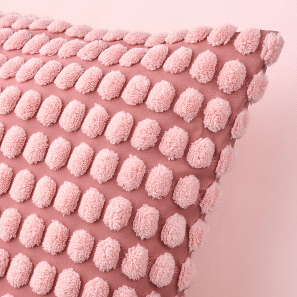
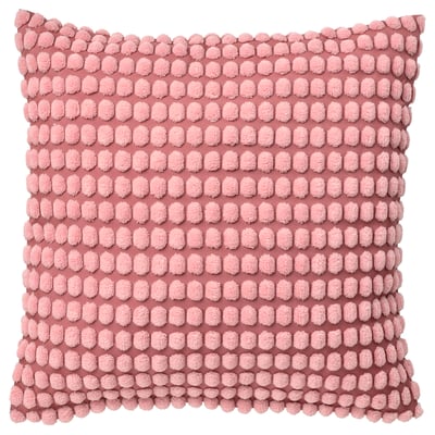
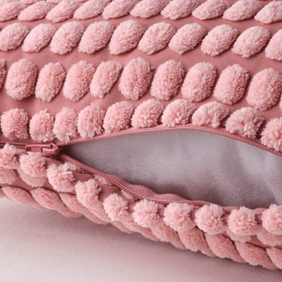
A light pink SVARTPOPPEL cushion cover
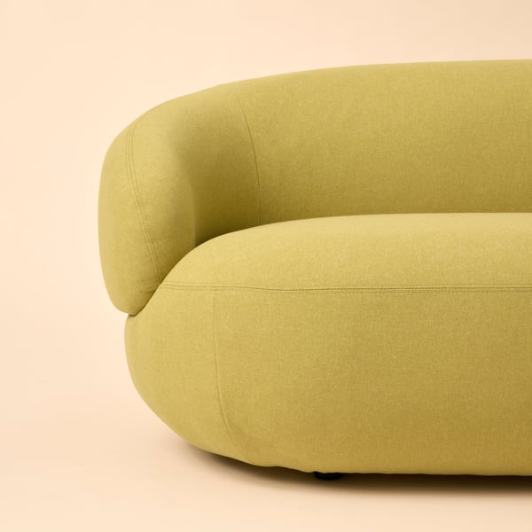
Part of a bright-green-yellow LILLESÄTER three-seat sofa, placed against a pale-yellow background.
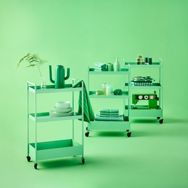
Three light green NISSAFORS trolleys on castors loaded with small bathroom, dinnerware and sewing items.
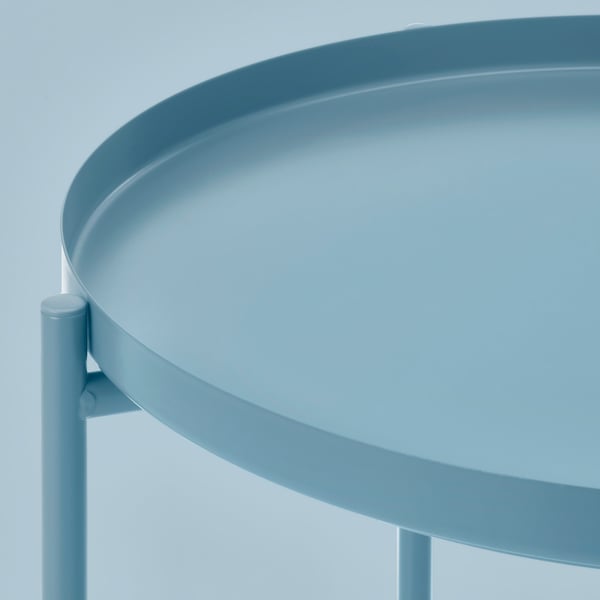
GLADOM blue
Shop the trend

A palette for peace

Paired with organic shapes and fluid forms, pastels help create a soothing, lived-in environment that feels like a true sanctuary.

Shop now
Shop now
Pastel tones are no longer just accents, they’re part of a new language of living. When integrated into walls and custom furnishings, they offer a subtle vitality that transforms spaces into calm, expressive environments. It’s about creating homes that feel emotionally attuned and visually fluid, where colour becomes a quiet force for wellbeing.
Christine GoughHome Furnishing Direction Leader
Take a softer seat

Curved lines, muted colours and plush textures turn every chair into a calm escape — designed to slow you down, not just sit you down.

Shop the trend
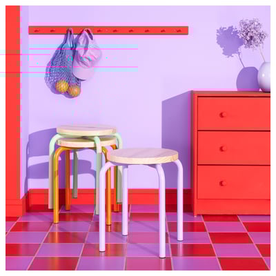
Colourful chairs stacking on top of one another
Shop the trend

Softness, reimagined

Pastel tones and flowing forms bring calm, comfort and quiet energy into every corner of your home.

Shop now
Shop now

Colours that soothe

Muted tones to turn everyday spaces into restful retreats.

Shop the trend
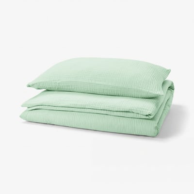
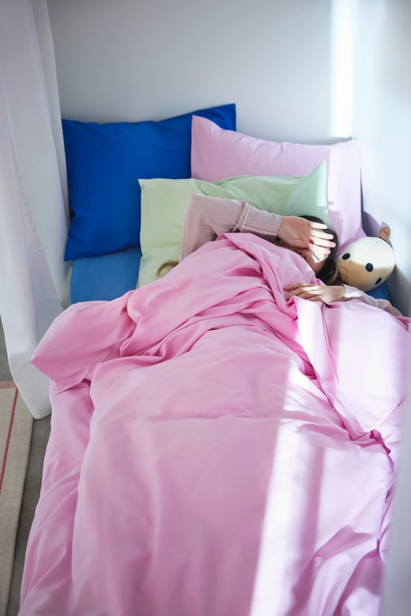
A pink PILTANDVINGE duvet cover and pillowcase in the bedroom
A light green OFTAST serving bowl
A pink PILTANDVINGE duvet cover and pillowcase in the bedroom
A green/off-white RINGKLOCKA rug, low pile
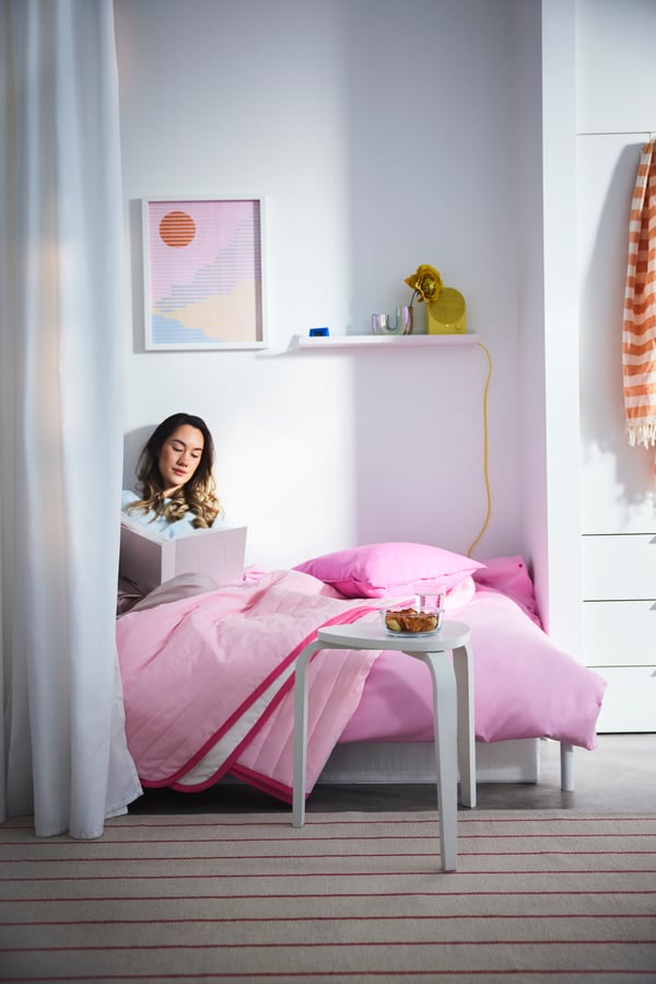
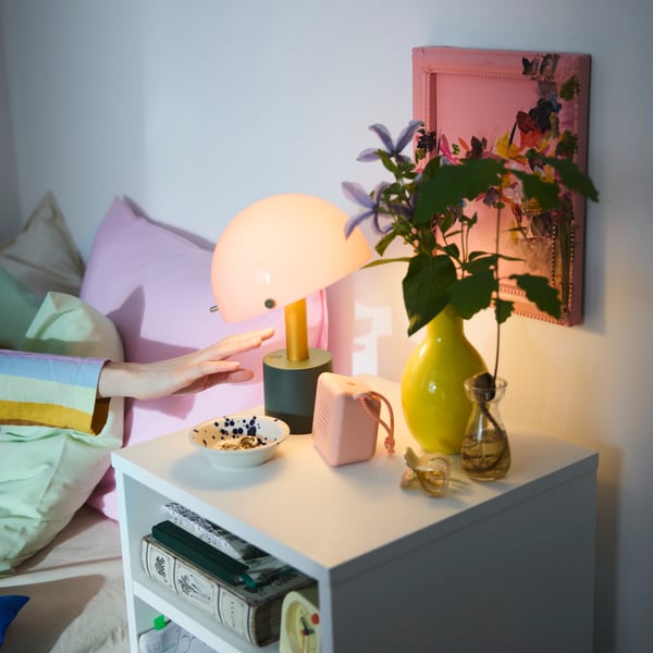
A NÖDMAST LED portable lamp casting a cosy light from a bedside table with pastel decoration next to a bed with pink pillows.
Shop the trend
Pastels don’t have to feel overly sweet or juvenile. When paired with deeper tones like burgundy, navy, or forest green, they gain contrast and character bringing sophistication to the space.
Shona JacksonInterior Design Manager

Pastels, served daily

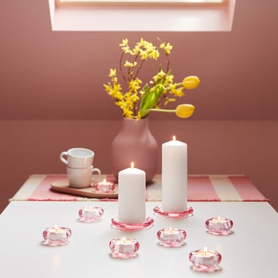
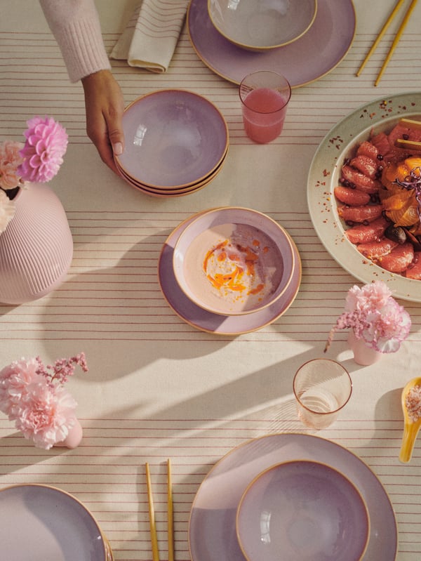
Pastel tones and organic forms brings warmth and personality to the table.

Explore more
A person puts a stack of bowls, part of a light pink FÄRGKLAR 18-piece service set, by a vase while setting a table.
Explore more

See more styling ideas