Published 03 May 2017 • Inter IKEA newsroom
PÅTÅR coffee packaging design wins at Dieline Awards 2017
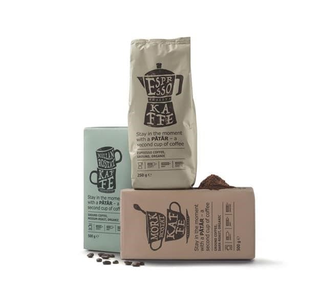
Today PÅTÅR, the new packaging design of the IKEA coffee range, is awarded in The Dieline Award 2017. The new design is part of a new packaging strategy for the IKEA Swedish Food Market products, where new packaging and design underlines the Swedish heritage in a playful, clear and warm way.
The IKEA Food communication team has developed a new packaging design strategy for IKEA to bring Swedishness through the IKEA food items to the 650 million food guest at the IKEA stores around the world. The packaging design has been developed together with BAS ID, a Swedish strategic design and brand agency specializing in commercial innovation.
IKEA product packaging is an important contributor to positioning the IKEA brand and food range, and has the task of telling stories around Swedish food culture. PÅTÅR means a refill of coffee. Other range families are ALLEMANSRÄTTEN - the family of meatballs ( name meaning “everyone´s right to access the Swedish nature”), MUNSBIT snacks and oat drinks (meaning “just a mouthful”) and the seafood range SJÖRAPPORT, meaning the “sea weather report”.
"We are thrilled that our coffee range PÅTÅR has been awarded the Dieline Award 2017," says Kajsa Sjödahl, Commercial Communication Manager, IKEA Food Services AB. "We are very proud of our range and through the packaging we can share the inspiring, transparent and honest stories of Swedish food culture."
The PÅTÅR coffee packaging design is awarded First place in the category Nonalcoholic beverages of the Dieline Awards 2017 with the statement:
“A new design and packaging strategy for IKEA Food. The idea is built with a playful attitude in mind. The revised design in combination with the storytelling will build curiosity around the new products.”
Marie Wollbeck, Creative Director at BAS ID explains, "We have created a playful and innovative combination of design and story telling that contributes to a curiosity around the products. The packaging design shows a clear connection to food and its context, with a twinkle in the eye."